
Mobile-First WordPress Design: Reaching Your Audience on the Go
Mobile-First WordPress Design: Reaching Your Audience on the Go
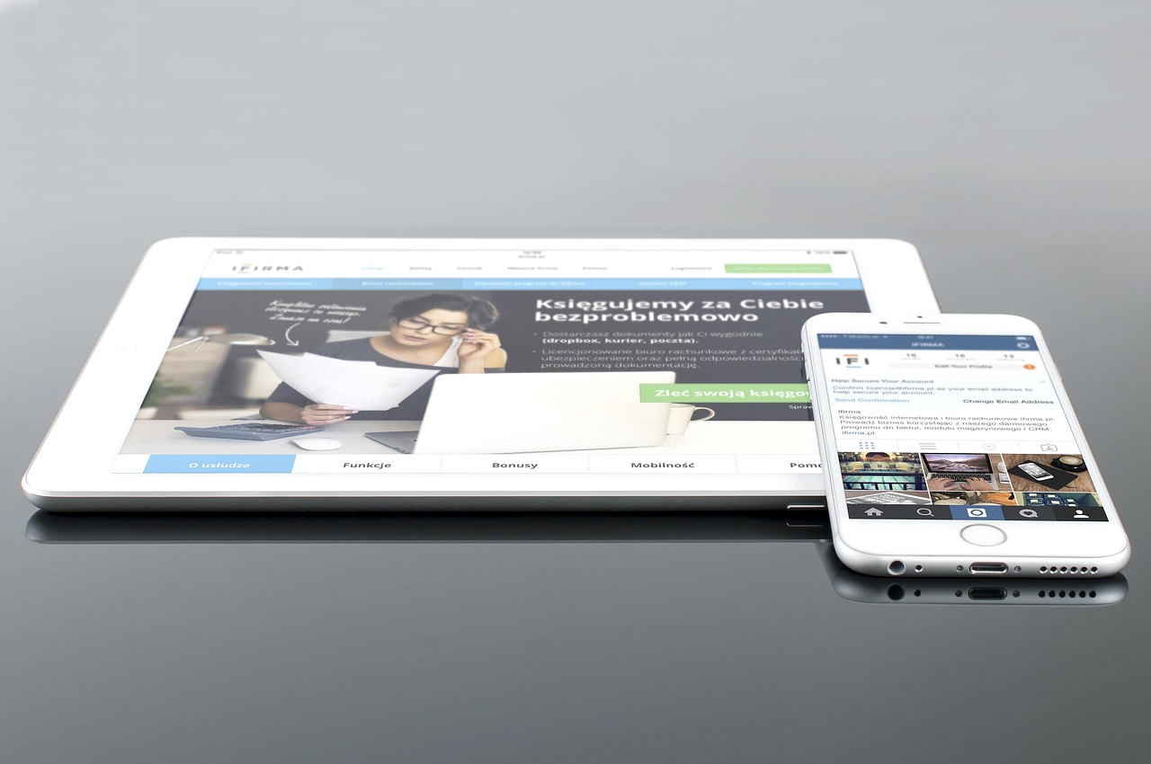
In 2025, if your website isn’t prioritizing mobile users, you’re not just missing out – you’re actively hindering your business. Mobile traffic dominates web usage, demanding a shift from desktop-centric design to a mobile-first approach.
Why Mobile-First Matters More Than Ever
The landscape has changed. No longer is mobile an afterthought; it’s the primary way many users experience the web.
-
Google prioritizes mobile indexing. A responsive design isn’t enough anymore; Google actively crawls and indexes the mobile version of your site first. This directly impacts your search rankings.
-
User Expectations: Users expect seamless and intuitive experiences across all devices. A clunky mobile site leads to immediate frustration and abandonment.
- Conversion Rates: Optimized mobile experiences directly translate into higher conversion rates. Easier navigation, faster load times, and streamlined forms boost sales and leads.
☏ 619-724-9517 | ✉️ info@zeorbit.com
Need help making the shift? Let’s talk.
Essential Principles of Mobile-First WordPress Design
Shifting to mobile-first isn’t just about shrinking your desktop site. It’s a fundamental change in how you think about design and content.
1. Prioritize Content & Functionality
Think essential features first. What do mobile users need to accomplish quickly?
-
Identify core tasks: What do users primarily use your site for on mobile? (e.g., browsing products, booking appointments, finding contact information).
-
Strip away the clutter: Remove unnecessary elements that slow down the page or distract users on smaller screens.
- Content Hierarchy: Structure your content to prioritize key information, making it easily scannable on mobile devices.
2. Embrace Simplicity and Minimalism
Less is definitely more.
-
Streamlined Navigation: Simplify your navigation menu for easy access on smaller screens. Consider a hamburger menu or tabbed navigation.
-
Reduced Visual Load: Optimize images and videos for mobile devices to reduce file sizes and load times. Avoid large, unnecessary graphics.
- Clear Calls to Action (CTAs): Ensure your CTAs are prominent and easy to tap on smaller screens.
3. Optimize for Touch
Mobile is a touch-based experience. Design accordingly.
-
Button Size: Ensure buttons and links are large enough to tap comfortably with a finger. (At least 44×44 pixels is a good rule of thumb).
-
Spacing: Provide ample space between interactive elements to prevent accidental taps.
- Touch Gestures: Consider implementing touch gestures (e.g., swipe to navigate) to enhance the user experience.
4. Speed is King (and Queen!)
Page speed is critical on mobile. Users expect instant gratification.
-
Optimize Images: Compress images without sacrificing quality. Use modern image formats like WebP.
-
Leverage Browser Caching: Enable browser caching to store static assets locally, reducing load times for repeat visitors.
-
Minimize HTTP Requests: Reduce the number of HTTP requests by combining files, using CSS sprites, and optimizing your code.
- Choose a fast hosting provider: Your hosting significantly impacts website speed. Select a provider optimized for WordPress and mobile performance.
5. Responsive Design is a Foundation, Not the Finish Line
While responsive design adapts to different screen sizes, mobile-first goes deeper.
-
Responsive design ensures your website adapts to different screen sizes. It rearranges and resizes elements to fit the available space.
-
Mobile-first design starts with the mobile experience and then progressively enhances it for larger screens.
- Focus on creating a lean and efficient mobile experience, and then adding features and complexity for desktop users.
WordPress Themes & Plugins for Mobile-First Design in 2025
WordPress offers a vast ecosystem of themes and plugins to help you achieve a mobile-first design.
Recommended Themes:
Look for themes specifically designed with a mobile-first approach. Here are some popular choices to consider in 2025, keeping in mind the evolving WordPress landscape:
- Kadence: Known for its lightweight codebase and customizable header and footer builder. Excellent for performance and flexibility.
- Astra: Another popular lightweight theme with a focus on speed and performance. Integrates seamlessly with page builders.
- GeneratePress: A minimalist theme designed for speed and accessibility. Highly customizable with a clean and simple design.
- Hello Elementor: A blank canvas theme designed specifically for use with the Elementor page builder. Allows for complete control over the design.
-
Neve: A fast and lightweight theme perfect for small businesses and startups. Easy to customize and optimize for mobile.
- Remember to check theme reviews and compatibility with the latest version of WordPress before making a decision.
Essential Plugins:
-
WP Rocket: A premium caching plugin that dramatically improves website speed.
-
Smush: Optimizes and compresses images to reduce file sizes without sacrificing quality.
-
Autoptimize: Optimizes CSS, JavaScript, and HTML to improve page load times.
-
AMP for WP: (Accelerated Mobile Pages) Creates stripped-down versions of your pages for lightning-fast loading on mobile devices. Note: AMP is becoming less critical as general mobile optimization improves.
- Keep an eye out for better optimization techniques that might replace AMP in the future.
- WPForms or Gravity Forms: Create mobile-friendly forms that are easy to fill out on smaller screens.
Implementing a Mobile-First Design: A Step-by-Step Guide
Here’s how to implement a mobile-first design for your WordPress website:
-
Audit Your Existing Website: Use Google PageSpeed Insights to assess your current mobile performance. Identify areas for improvement.
-
Choose a Mobile-First Theme: Select a theme that prioritizes mobile design and performance.
-
Plan Your Content: Create a content strategy that focuses on the essential information mobile users need.
-
Design for Mobile First: Design your website starting with the mobile experience. Use a wireframing tool to plan the layout and user flow.
-
Optimize Images and Media: Compress images and optimize videos for mobile devices.
-
Implement Caching and Optimization Plugins: Install and configure plugins to improve website speed and performance.
-
Test on Multiple Devices: Thoroughly test your website on a variety of mobile devices and screen sizes.
- Monitor and Iterate: Continuously monitor your website’s mobile performance and make adjustments as needed.
FAQs About Mobile-First WordPress Design
-
Q: Is responsive design enough?
- A: Not anymore. While responsive design is a component of mobile optimization, mobile-first design is a more comprehensive approach that prioritizes the mobile user experience.
-
Q: How do I test my website on different mobile devices?
- A: Use browser developer tools (e.g., Chrome DevTools) to emulate different devices. Also, test on physical devices whenever possible. Online tools like BrowserStack can help with cross-device testing.
-
Q: What are the key metrics to track for mobile performance?
- A: Page load time, bounce rate, conversion rate, mobile traffic, and time on page.
-
Q: How often should I update my website’s mobile design?
- A: Regularly! The mobile landscape is constantly evolving. Stay up-to-date with the latest trends and best practices. Aim for at least annual design reviews and updates.
-
Q: What is the future of mobile-first design?
- A: We anticipate a further shift towards personalized mobile experiences, enhanced accessibility, and greater integration with emerging technologies like augmented reality (AR) and voice search. Expect to see more emphasis on micro-interactions and seamless transitions between devices.
How-To: Speed Up Your Mobile WordPress Site (Quick Wins)
-
Run a Speed Test: Use Google PageSpeed Insights or GTmetrix. Note your current score.
-
Compress Images: Use a plugin like Smush to bulk optimize all existing images.
-
Enable Caching: Install and activate a caching plugin like WP Rocket or LiteSpeed Cache.
-
Choose a Lightweight Theme: If your current theme is bloated, switch to a faster, mobile-friendly theme.
- Test Again: Re-run the speed test and compare your results.
Investing in a Mobile-First Future
Mobile-first WordPress design isn’t just a trend; it’s a necessity. By prioritizing the mobile user experience, you can improve your search rankings, increase engagement, and drive conversions.
☏ 619-724-9517 | ✉️ info@zeorbit.com
Ready to transform your mobile presence? We can help. Let’s talk about your project.