
Responsive Web Design Best Practices for Mobile Users
This blog was designed by ZeOrbit, a Business Web Designer specializing in Website Design, Responsive Web Development, Mobile App Development (iOS/Android), SEO Services, UI/UX Optimization, and Digital Marketing.
In 2026, mobile devices drive over 60% of all web traffic that number keeps climbing. Non-responsive sites? Users bounce fast, hurting your rankings, traffic, and conversions.
At Zeorbit, a top-rated San Diego web design and web development agency, we build custom websites that are fully responsive, mobile-first, and built to convert & rank.
Here are the simple, high-impact best practices we use every day:
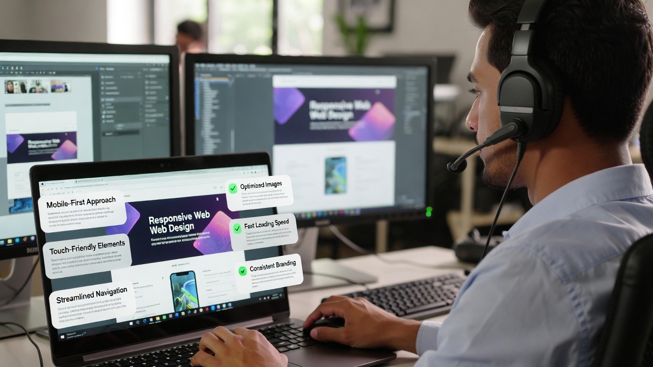
- Go Mobile-First (Always Start Small)
Design for smartphones first, then scale up. Keeps things clean, fast, and user-focused. - Use Fluid Grids & Flexible Images
Percentages + CSS Grid/Flexbox + WebP images = layouts that adapt automatically. - Set Smart Breakpoints
~320–480px (mobile), ~768px (tablet), ~1024px+ (desktop). Test on real devices! - Prioritize Speed & Performance
Under 2-second loads. Our clients see up to 20x faster sites after migration. - Touch-Friendly UI/UX Design
Big buttons, thumb-friendly spacing, no tiny text or hover-only elements. - Boost Accessibility (ADA-Compliant)
Proper contrast, alt text, keyboard navigation — good for users and Google. - Test Relentlessly
Real devices, real users, different orientations. Nothing beats live testing.
These aren’t just nice-to-haves — they’re essential for driving qualified traffic, increasing conversions, and dominating search in 2026.
Ready to make your site mobile-ready and unstoppable?
Let’s build a site that converts on mobile — and ranks everywhere.
Your move!