
Responsive Website Designer: Adapting to All Devices
Responsive Website Designer: Adapting to All Devices
☏ 619-724-9517 | ✉️ info@zeorbit.com
In today’s digital landscape, having a website is no longer optional – it’s essential. But simply having a website isn’t enough. Your website needs to be accessible and engaging across all devices, from desktop computers to smartphones and tablets. This is where the expertise of a responsive website designer comes into play. This article dives deep into the world of responsive web design, exploring its importance, principles, and the skills required to master it.
What is Responsive Web Design?
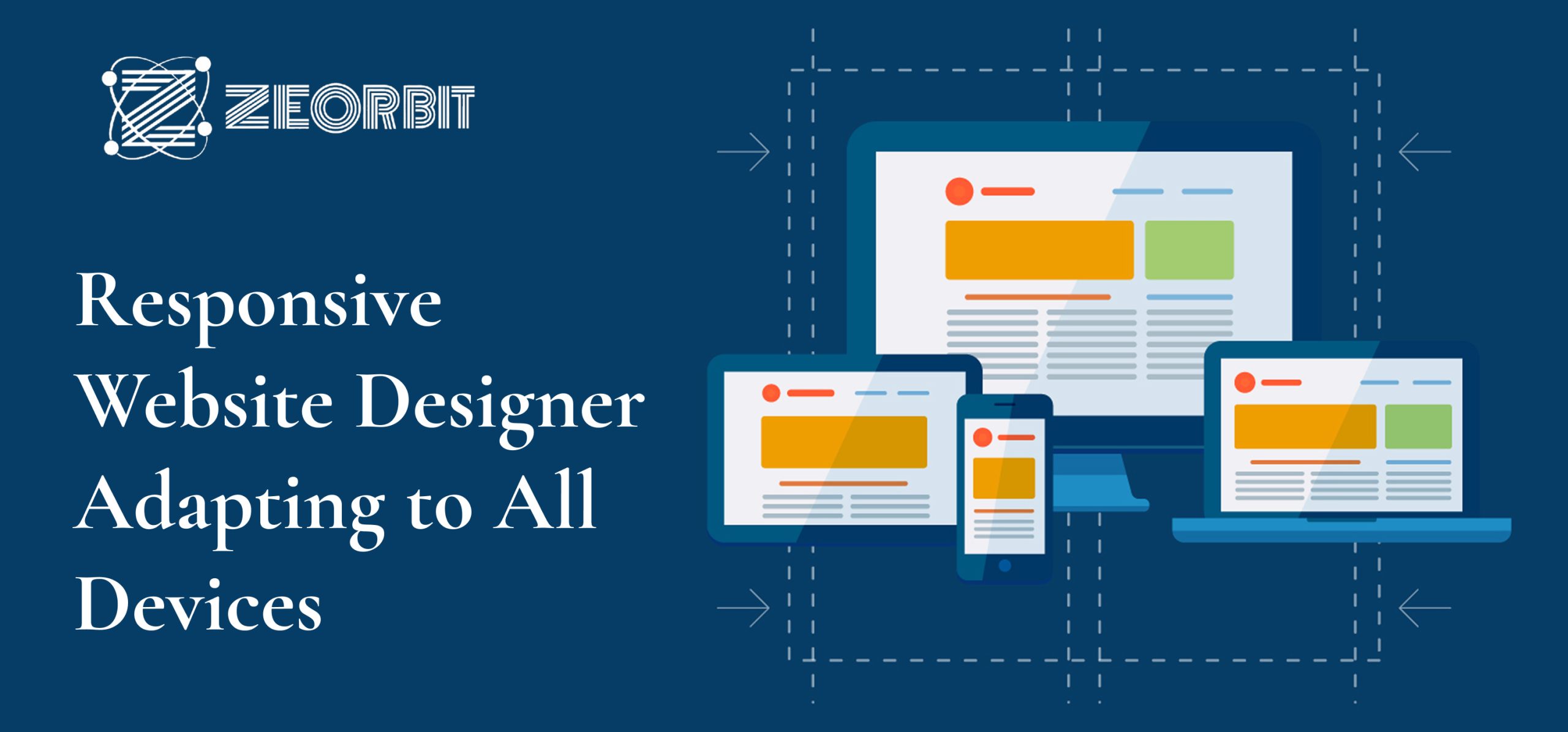
Responsive web design is an approach to web design that aims to create web pages that render well on a variety of devices and window or screen sizes. The core principle is to use flexible layouts, flexible images, and CSS media queries to adapt the presentation of the website based on the user’s device. Instead of creating separate versions of a website for desktop and mobile, a responsive design dynamically adjusts to fit the screen.
Why is Responsive Design Crucial?
- Mobile-First World: More internet traffic comes from mobile devices than desktop computers. Ignoring mobile users means missing out on a significant portion of your potential audience.
- Improved User Experience: A responsive website provides a seamless and consistent experience regardless of the device used. This leads to increased engagement and lower bounce rates.
- SEO Benefits: Google favors responsive websites in its search rankings. A mobile-friendly site contributes to better search engine optimization (SEO).
- Cost-Effective: Maintaining one responsive website is more cost-effective than maintaining separate desktop and mobile versions.
- Future-Proofing: Responsive design helps ensure your website remains accessible as new devices and screen sizes emerge.
The Pillars of Responsive Web Design
Responsive web design isn’t just about making a website smaller on a phone. It’s built on a few core principles:
- Fluid Grids: Instead of using fixed pixel widths, fluid grids use percentages to define the width of elements. This allows the layout to adapt to different screen sizes.
- Flexible Images: Images should also scale proportionally to fit the container they are in. Techniques like
max-width: 100%; height: auto;in CSS prevent images from overflowing their containers. - Media Queries: These CSS rules allow you to apply different styles based on device characteristics, such as screen size, resolution, and orientation.
Different Types of Responsive Design Techniques
While the principles remain consistent, the specific techniques used in responsive web design can vary depending on the project’s needs. Here are a few common approaches:
- Mobile-First Design: This approach starts with designing for the smallest screen size (mobile) and then progressively enhances the design for larger screens. It ensures that the core functionality is always accessible.
- Graceful Degradation: This involves designing for the best possible browser and then providing fallbacks for older or less capable browsers.
- Progressive Enhancement: Similar to graceful degradation, but it starts with a basic level of functionality that works in all browsers and then adds more advanced features for modern browsers.
The Role of a Responsive Website Designer
A responsive website designer is a skilled professional who possesses a deep understanding of web design principles, coding languages, and user experience (UX). Their role goes beyond just making a website look good; it’s about creating a website that is:
- User-Friendly: Easy to navigate and use, regardless of the device.
- Accessible: Compliant with accessibility standards (like WCAG) to ensure usability for people with disabilities.
- Performance-Optimized: Loads quickly and efficiently on all devices.
- Visually Appealing: Has a modern and engaging design that reflects the brand.
Key Skills of a Responsive Website Designer
- HTML: The foundation of all web pages. A strong understanding of HTML structure and semantics is essential.
- CSS: Used to style and layout web pages. Proficiency in CSS, including concepts like the box model, selectors, and positioning, is crucial.
- JavaScript: Adds interactivity and dynamic behavior to websites. Knowledge of JavaScript is necessary for implementing features like animations, form validation, and AJAX.
- Media Queries: The ability to write effective media queries to target different devices and screen sizes.
- UI/UX Design: Understanding user interface (UI) and user experience (UX) principles to create user-centered designs.
- Wireframing and Prototyping: Creating visual representations of the website’s layout and functionality before coding.
- Responsive Design Frameworks (e.g., Bootstrap, Foundation): Using pre-built frameworks to speed up the development process and ensure consistency.
- Version Control (e.g., Git): Using version control systems to track changes and collaborate with other developers.
- Testing and Debugging: Thoroughly testing websites on different devices and browsers to identify and fix bugs.
Tools of the Trade
Responsive website designers rely on a variety of tools to streamline their workflow and create high-quality websites.
- Code Editors (e.g., VS Code, Sublime Text): Used for writing and editing code.
- Browser Developer Tools: Built-in tools in web browsers that allow designers to inspect and debug web pages.
- Image Optimization Tools: Used to compress and optimize images for web use.
- Testing Tools (e.g., BrowserStack, LambdaTest): Allow designers to test websites on different browsers and devices.
- Collaboration Tools (e.g., Slack, Trello): Used for communication and project management.
- Design Software (e.g., Adobe Photoshop, Figma, Adobe XD): Used for creating mockups and visual designs.
The Future of Responsive Design
Responsive design is constantly evolving to keep pace with new technologies and user behaviors. Some emerging trends include:
- Mobile-First Indexing: Google primarily uses the mobile version of a website for indexing and ranking.
- Voice User Interface (VUI): Designing websites that can be controlled by voice.
- Artificial Intelligence (AI): Using AI to personalize website content and improve user experience.
- Dark Mode: Offering a dark theme option for users who prefer it.
- Accessibility Focus: An increasing emphasis on building websites that are accessible to everyone, regardless of their abilities.
Conclusion
In conclusion, a responsive website designer is crucial for creating websites that thrive in today’s multi-device world. By understanding the principles of responsive design and mastering the necessary skills, designers can create websites that are user-friendly, accessible, and visually appealing across all devices. Investing in a responsive website is an investment in your online presence and future success. Making sure your website is optimized for a variety of screen sizes is essential for capturing a wide audience and maintaining a competitive edge.