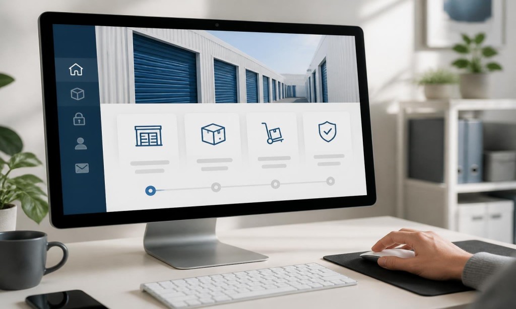
The “Rent Now” or “Reserve a Unit” button shouldn’t compete with your other menu items. It should stand out visually, appear in the header on every page, and follow visitors as they scroll if your design uses a sticky navigation bar.
This is one of the most impactful website features every storage facility needs and one of the most frequently overlooked.
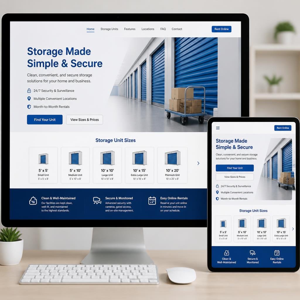
Use Descriptive Page Labels
“Services” is vague. “Storage Units” is clear. “About Us” is fine. “FAQ” is better than “Resources.” Label your pages the way your customers think, not the way your web designer thinks.
This also helps with SEO-friendly website optimization, since descriptive labels improve internal linking context and keyword relevance.
Don’t Bury Important Information
Customers looking for unit sizes, pricing, or a phone number should find it within one or two clicks maximum. If a visitor has to dig through three levels of navigation to find your rates, they won’t.
Self storage website design that follows this principle consistently sees lower bounce rates and higher time-on-site.
Mobile-friendly self storage websites use a hamburger menu (the three-line icon) to keep things clean on small screens. But the “Rent Now” button and phone number should remain visible outside the hamburger menu, always accessible without a tap.
This is where many storage facility website development projects fall short. Mobile navigation is treated as an afterthought instead of a primary design consideration.
A bloated navigation menu with dropdown mega-menus and animation effects can slow your site down. Fast websites increase storage rentals, and your navigation is part of the performance equation. Keep it lean.
Test Your Navigation With Real Users
Before launch, ask someone unfamiliar with your site to find your pricing and book a unit. Watch where they hesitate. That hesitation is costing you rentals.
ZeOrbit Builds Storage Websites With Navigation That Converts