A website that looks good but doesn’t convert is just an expensive brochure. The best layouts for storage company websites are designed around one goal: turning visitors into renters as efficiently as possible.
Here’s what those layouts look like and why they work.
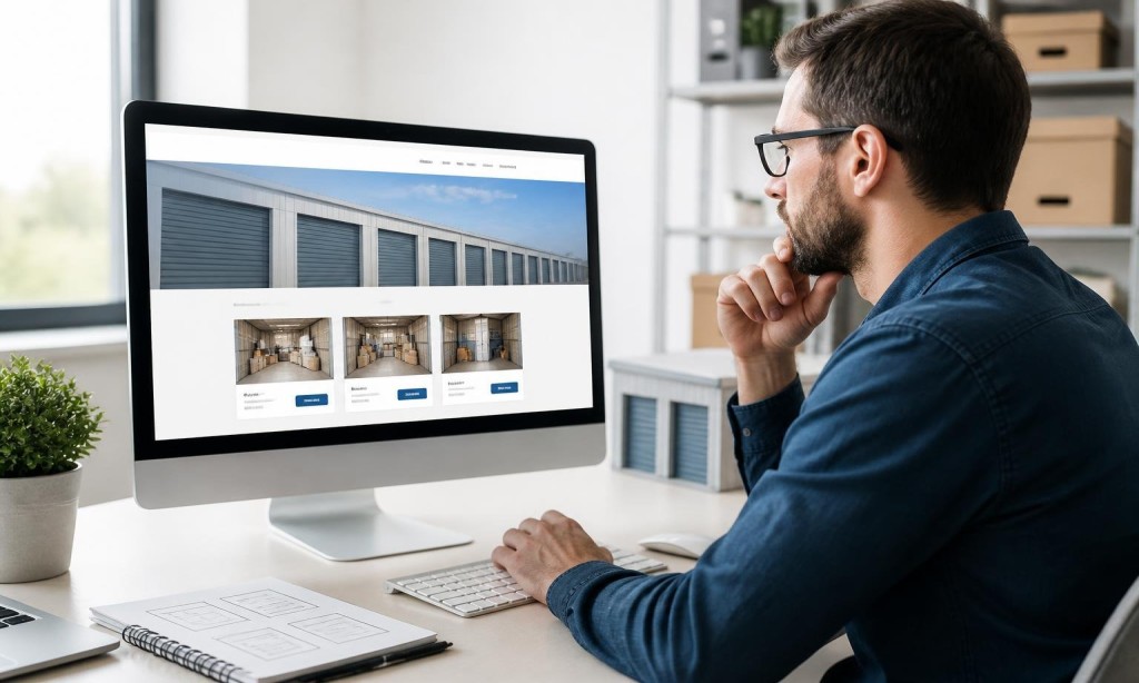
The Homepage: Your Most Important Page
Your homepage has one job: get the visitor to the next step, whether that’s browsing units, checking availability, or clicking “Rent Now.”
The best layouts for storage company websites structure the homepage like this:
Hero section: Facility name, location, a one-line value prop, and a bold CTA button
Unit overview: A quick visual grid of available unit sizes with pricing
Trust signals: Star ratings, number of units, years in business
How it works: Three-step booking process, simple and visual
Service area: Cities and neighborhoods you serve
Reviews: Real customer testimonials
Final CTA: Another “Reserve a Unit” button before the footer
Each unit size should have its own page or clearly defined section. Self storage website design at this level includes:
A photo or illustration of the unit
A real-world size comparison (“fits a 2-bedroom apartment”)
Pricing and availability
A direct booking button
This is core to good storage booking website design. Don’t make customers work to find what they need.
Location Pages: Built for Local SEO
If you serve multiple cities or neighborhoods, each location deserves its own page. These pages are the foundation of SEO-friendly websites that rank for city-specific searches.
Each location page should include the city name naturally throughout, a Google Maps embed, local landmarks for reference, and a contact form or CTA tailored to that area.
Self storage website navigation best practices apply across all layouts. The menu should include: Home, Unit Sizes, Locations, About, and Contact. That’s it.
The “Rent Now” button should be a separate, always-visible element in the header.
Mobile Layout Considerations
Every layout decision must be validated on mobile. Mobile-friendly self storage websites restack columns, enlarge buttons, and simplify navigation automatically. If your layout breaks on a phone, it’s not a good layout.